
If not, you need to figure it out. Fast.
In your crew, you probably have some stars: High-performing technicians that know how to handle even the most complicated cases, and some of them even up-sell like crazy. On the other hand, you probably also have some mediocre technicians: Those with high-cancellation rates that don’t bring as much revenue as the others. Maybe because of the nature of their jobs, or perhaps because they’re not very good at selling.
Years ago, when I was running my locksmith business, I had one technician with cancellation rates out of the roof. To understand what was going on, I started accompanying him to some jobs, where I realized that the technician simply didn’t have the skill set to deal with commercial jobs.
Once I realized that I could fix the situation: Assigning him only to residential jobs and giving him proper training on the more complicated tasks.
Understanding which of your techs is the high-performer and which is the low-performer is critical for the success of your home service business. You need to make sure to retain the high-performing technicians and give more training to the low-performing technicians.
To help with that, we have created this FREE TEMPLATE. Just get your technicians to log their jobs in the spreadsheet, and it will generate a full report comparing the cancellation rates of each technician and the revenue they bring.
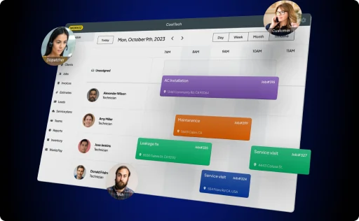
(Or, if you’re ready to take the next step as a service business owner, you can get started with Workiz and get this report and many others created automatically. You can read more about Workiz here.)
Instructions for using the template
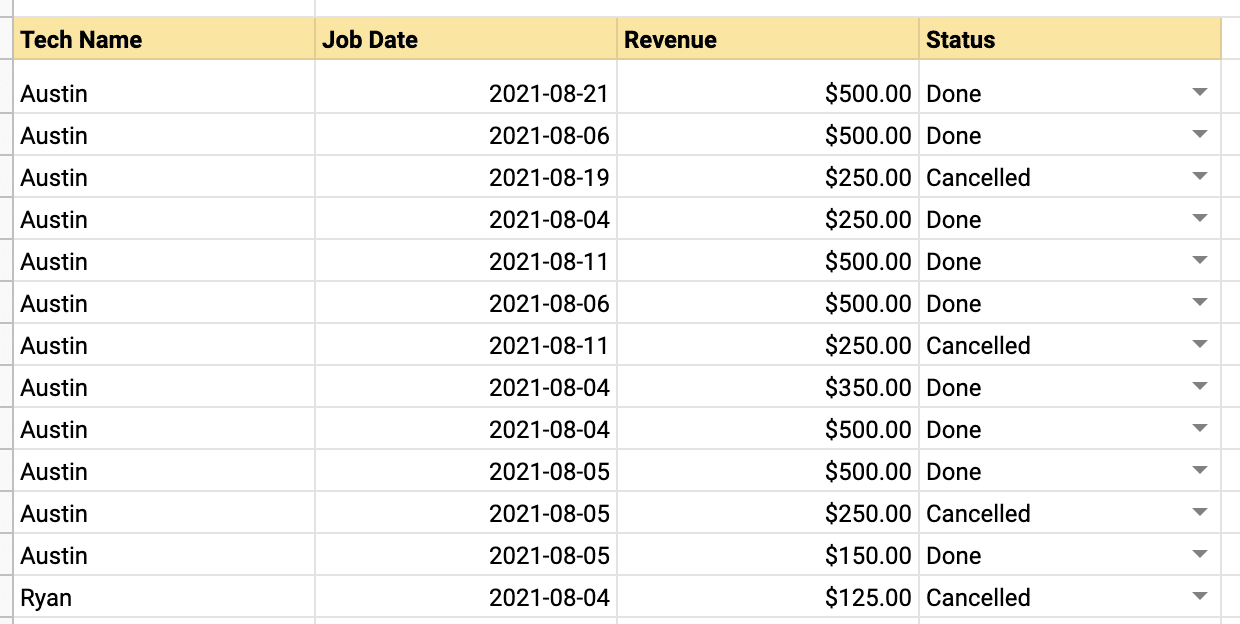
Every time a technician completes a job, they should log in to the Jobs Log table. They should:
- Write their name
- Choose the date on which the job took place
- Choose the status of the job (Done/Cancelled)
- Write the revenue the job brought in
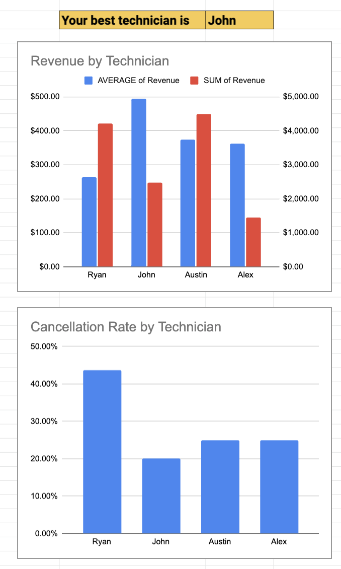
After enough data is collected, you, the business owner, can check the graphs to the right of the table. Those graphs automatically draw the data collected in the Jobs Log to show who is your best technician, each technician’s cancellation rate, and the revenue each technician brings in (both average and total).
Notes:
- To get started with the template, open this link, and click File -> Make a copy. Give the document a name and click OK.
- To share the document with your techs, click Share and type their email addresses into the “Add people and groups” field.
- The file you see contains lots of data, but that’s just for demonstration purposes. To start using the template, you need to remove all the data in the Jobs Log and fill in your own.


