Lucian Petronel Potlog, Haul N Junk. Dribble
Logos are essential to any brand as it’s the first impression someone will have of your company and it reaches everyone who has any contact with you. Because of this, it’s important to ensure your logo offers a favorable impression of your business. A strong logo represents your brand clearly and effectively while making you look like a long-time pro, even if you’re just starting out from your garage.

Represent your brand in a unique and honest way
This one sounds too obvious, but you’d be surprised how many business owners request a logo that is exactly like something they found through their competitive analysis. If your logo contains a symbol–or “bug”–it should relate to your industry, your name, a defining characteristic of your company, or a unique competitive advantage you offer.
What’s the overriding trait you want people to remember about your business? If, for example, the answer is how fast you can complete jobs, you’ll want to consider icons that signify speed as part of your logo–i.e., wings or a clock. Be original, get creative, but try not to do so at the expense of being crystal clear.

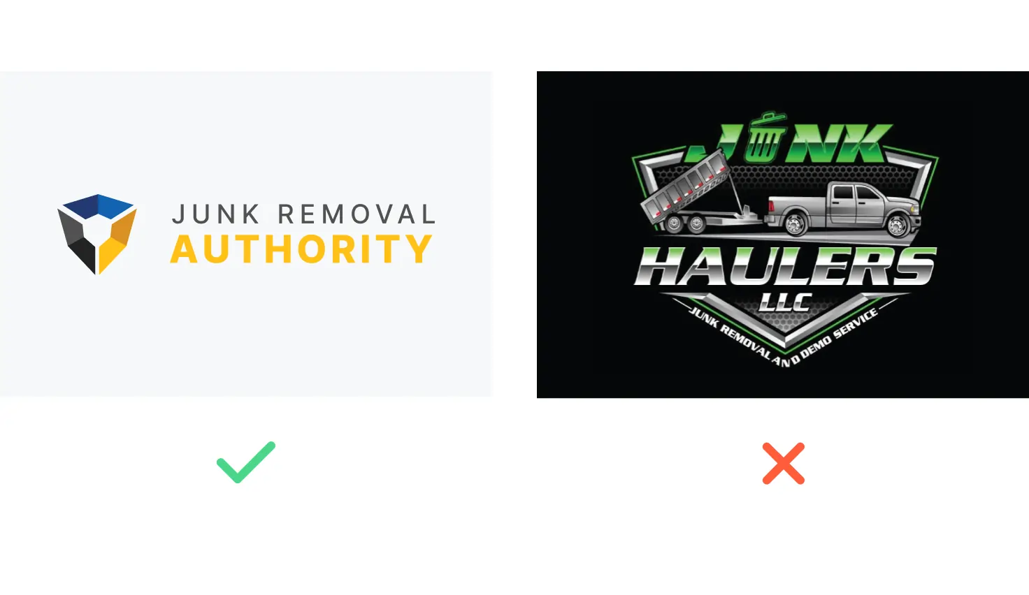
Avoid using too much detail
Simple logos are recognized faster than complex ones. For example; McDonald’s, Apple, Nike, and Coca-Cola are three of the most easily recognizable global brands. Just ask any parent who’s traveled by a McDonald’s with a hungry toddler about the power of those golden arches. Strong lines and letters show up better than thin ones, and clean, simple logos will scale much better than complicated ones.

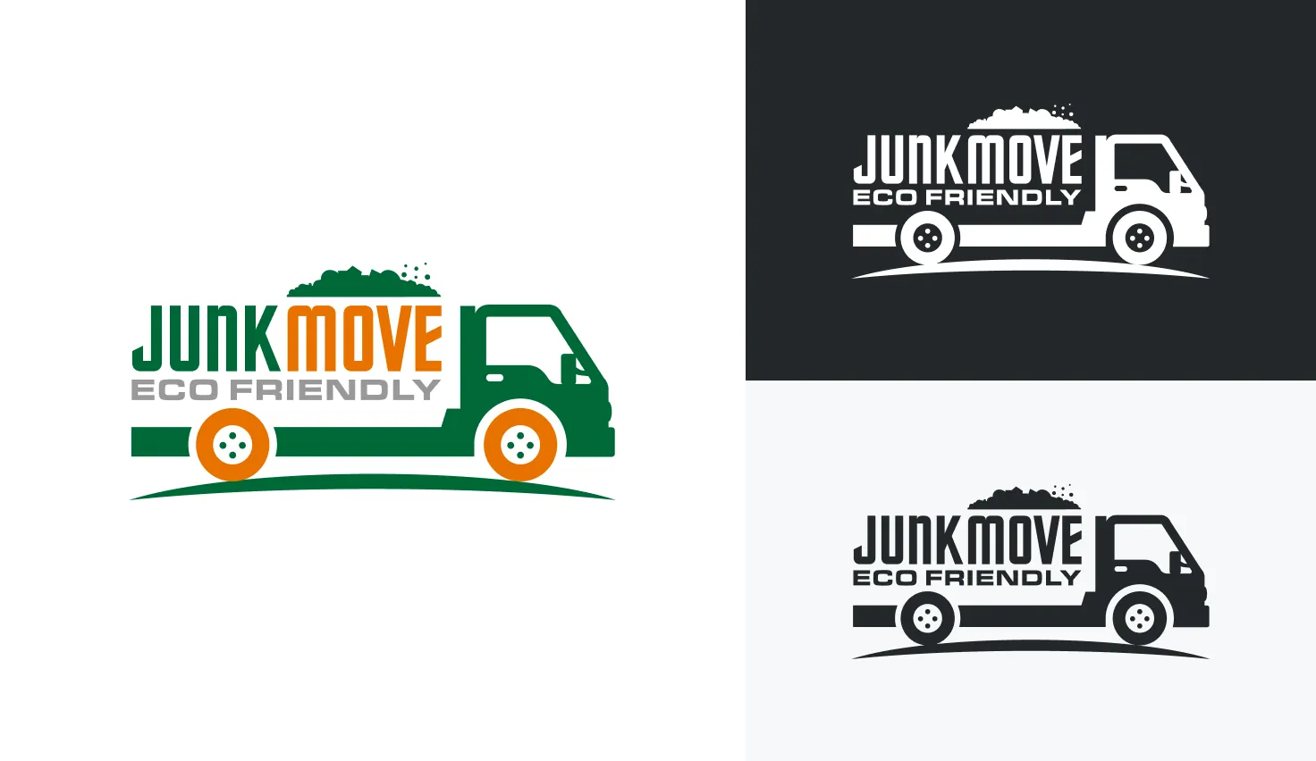
Try it in black and white
If your logo doesn’t look good in black and white, it won’t look good in any color. It’s also worth noting that printing costs for four-color logos are often much greater than that for one- or two-color jobs.

Make sure your logo scales as well as your business
A logo should be aesthetically pleasing in both small and large sizes, and in a variety of mediums. A good rule to follow to accomplish this is the business card/billboard rule; your logo should be clear and easy to understand in both formats.

Strike the right balance
Your logo should appear balanced to the eye–meaning no one part should be too bold or stand out enough to overpower the rest. Just as a painting would look odd if all the color and details were segregated in one corner, so do asymmetric logos. Color, line density, and shape all have an impact on your logo’s balance.
Logos are one of the most complex pieces of your brand puzzle, and it can be a lot to take in. If you need some inspiration, check out these Junk Removal logos created by real graphic designers on Dribbble.
Once you have your brand, messaging, and logo in a good place, you’re ready to turn your website into a lead-generating machine.


